What does it actually take to build a vintage clothing brand from nothing?
Sonya came to us with a vision for a brand new vintage clothing store in the heart of Kingsville, Ontario. She wanted something fierce — a brand that would stand out on a downtown street and still hold its own against online buyers across Canada.
In its first month, the business did $20,000+.
Here’s how the brand and the site came together.
Client Overview
Client: Rogue + Runway — Vintage Clothiers Inc.
Industry: Retail, Vintage & Contemporary Fashion
Location: 14 Division Street South, Kingsville, Ontario
Project Type: Brand Identity, Custom Shopify Storefront, Local SEO
Tech Stack: Shopify (backend + POS), custom front-end, custom scroll animations
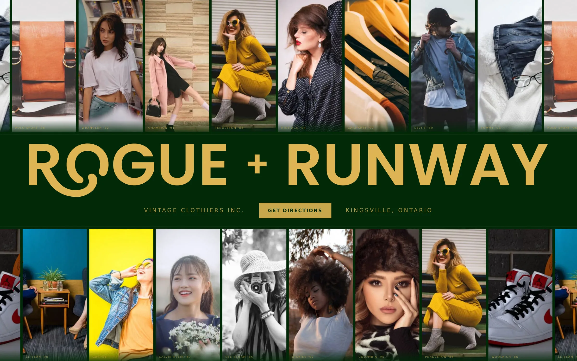
The Brief: A Thrift Store That Had to Feel Like a Fashion House
At Databending we only do fully custom branding and custom sites. That’s ideal for every brand — but for something as thoughtful and curated as what Sonya had in mind, it was a requirement. A theme would have flattened the whole idea.
The gap we had to close was perception. “Thrift store” and “luxury” don’t sit next to each other in most people’s heads. Everything we designed had to argue the opposite: that secondhand can be a first choice, and that a curated rack in Kingsville deserves the same treatment as a boutique in Yorkville.
Why Shopify — And Why We Deliberately Didn’t List Everything On It
Early conversations landed on Shopify for the backend. The reason was operational: it gives Rogue + Runway one seamless system across the in-store POS and the online storefront, so inventory and sales don’t live in two places.
But there’s a real problem with running a thrift store on eCommerce, and it’s worth being blunt about it. A store like R+R has hundreds — likely thousands — of unique, one-of-one items. Photographing, writing, and listing every single one is impossible, and for most of those pieces the labour costs more than the sale returns.
So we didn’t try. The online store caters to high-ticket items only. Everything else lives in the shop, where it belongs, and the site’s job is to drive people to the door.
That single decision shaped the entire design. If the site isn’t an endless catalogue, it has to be something better: an editorial.
What Actually Makes a Brand Feel Like Luxury
Before laying out a single section, we got specific about what we were reaching for. Luxury isn’t a price tag — it’s a set of signals, and vintage is unusually well positioned to send all of them.
Strong curation
- Smaller, highly curated collections
- Pieces selected around a particular aesthetic or era
- Clear, stated standards for condition
- Interesting or hard-to-find pieces
- Limited quantities
- A “drop” mentality rather than an endless catalogue
A distinctive visual identity
- A restrained colour palette
- Elegant typography
- Generous negative space
- Photography-led layouts and consistent art direction
- Subtle branding rather than loud branding
- Vintage references without looking costume-y
- Clothing in motion, not on a hanger
Scarcity
Luxury is strongly associated with limited availability — and vintage provides that for free. The language does a lot of work here: one of one, deadstock, rare, archive, limited drop, hand-selected, unrepeatable, no restocks. Every piece has a story and an aesthetic. We built the site to say so.
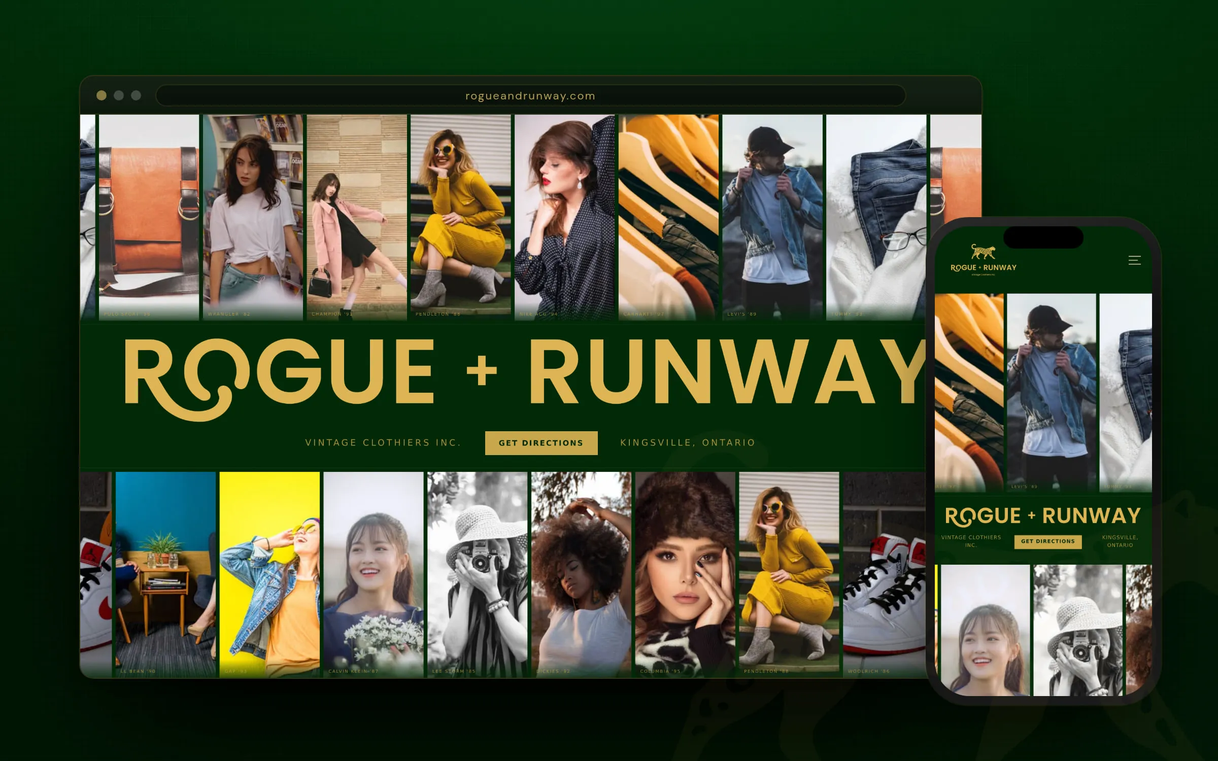
The palette we landed on runs deep forest green and gold on cream, with Playfair Display for editorial headlines and DM Sans carrying the body. Restrained, warm, and closer to a fashion masthead than a retail site.
Designing the Site: Editorial First, eCommerce Second
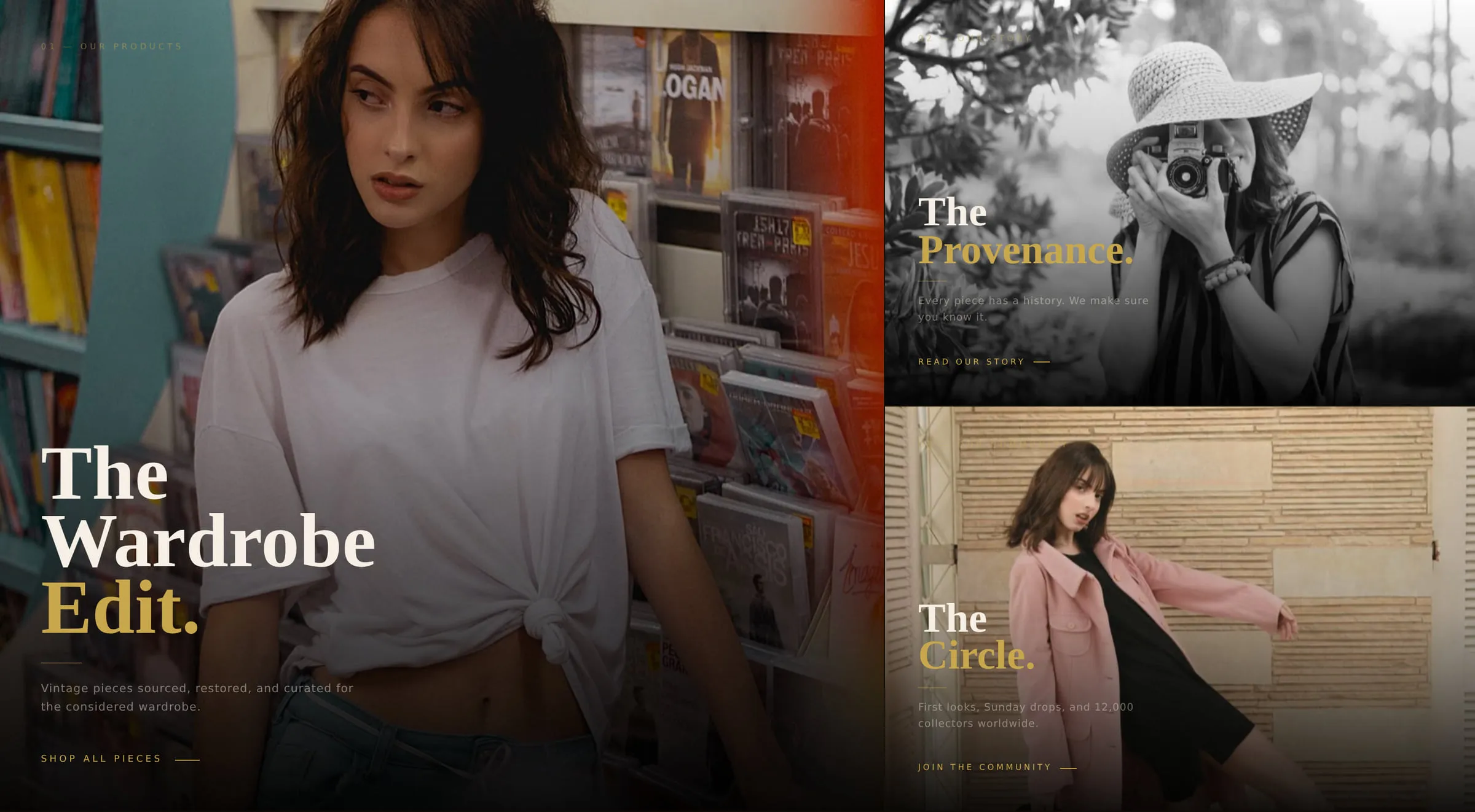
For layout, the inspiration was the great forefathers of fashion advertising — magazines and lookbooks, VOGUE above all. Bold, editorial, picture-led. Every section was built to pull a viewer’s eyes toward the clothes and that curated feeling.

The hero: a film photographer’s greatest hits
The hero is a constant feed of fashion icons and styles, running like a contact sheet — the point is to put shoppers in the mood for the aesthetic before they’ve read a word. It needed custom animation to work, so we built it: continuous marquee columns above and below the wordmark, moving at different speeds.
The brand statement, below the fold
Right under the hero, the promise lands:
We curate what others overlook, turning second-hand into first choice. Luxury, without the markup. Style, without the compromise. This is where your next favorite piece was always meant to find you.
That paragraph is the whole strategy in four sentences, so we gave it room — full-width, dark ground, gold leopard, nothing else competing for attention.
The brand story, told in four chapters
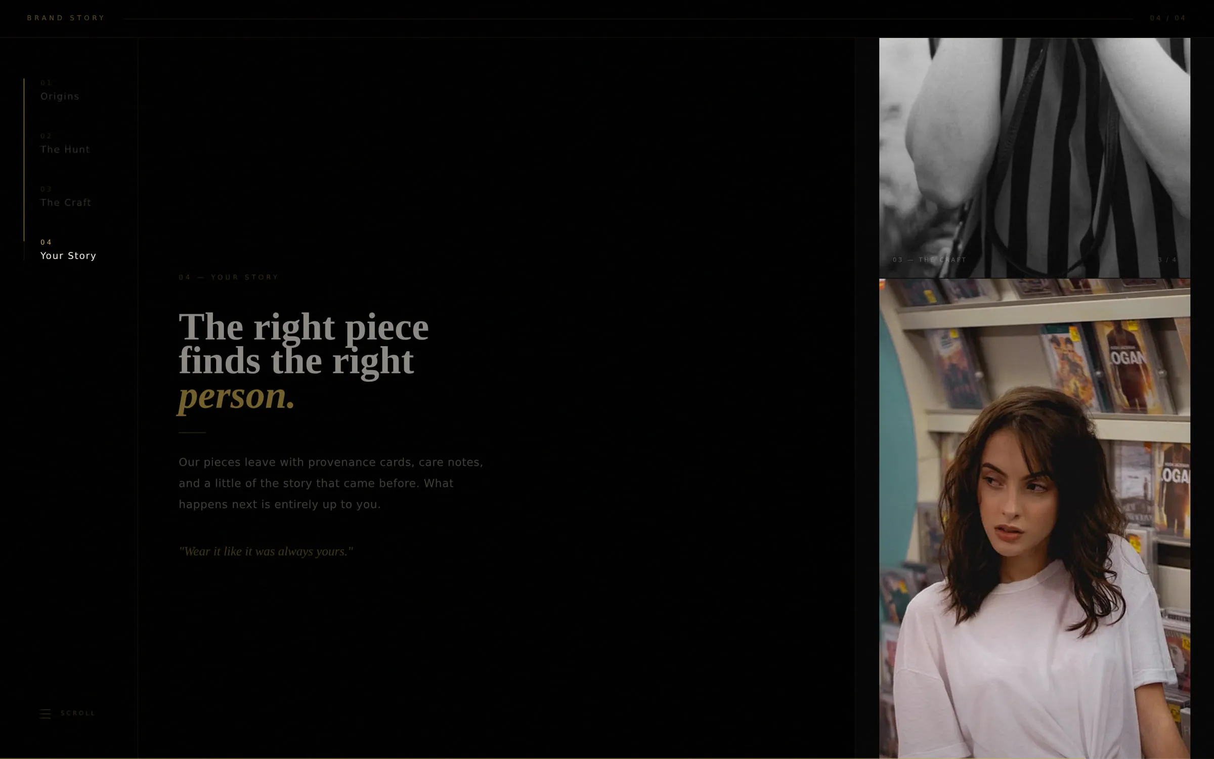
Rather than a wall of About text on the homepage, the brand story is a pinned scroll that moves through four chapters — Origins, The Hunt, The Craft, Your Story — each pairing one line of copy with one image. It’s the closest thing on the site to turning magazine pages, and it keeps people scrolling well past the fold.
Built for the Phone First
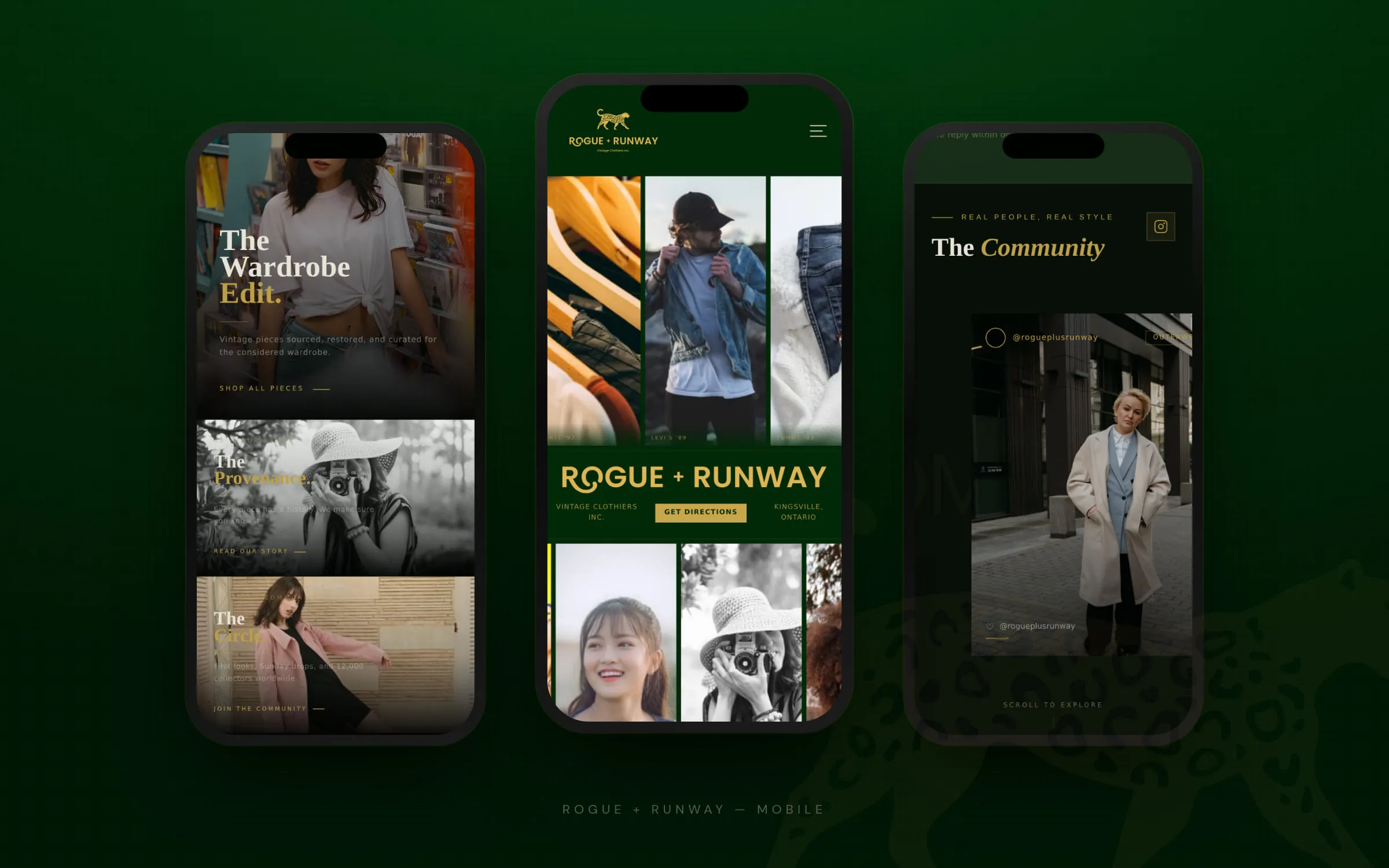
Most people meet a boutique like this on Instagram, which means they meet the site on a phone. The editorial layout had to survive the trip down to 390px — so the marquee columns reflow, the chaptered story becomes a vertical read, and the type scale holds its proportions instead of collapsing into a wall of small text.
The Community: Social Proof Built for Fashion
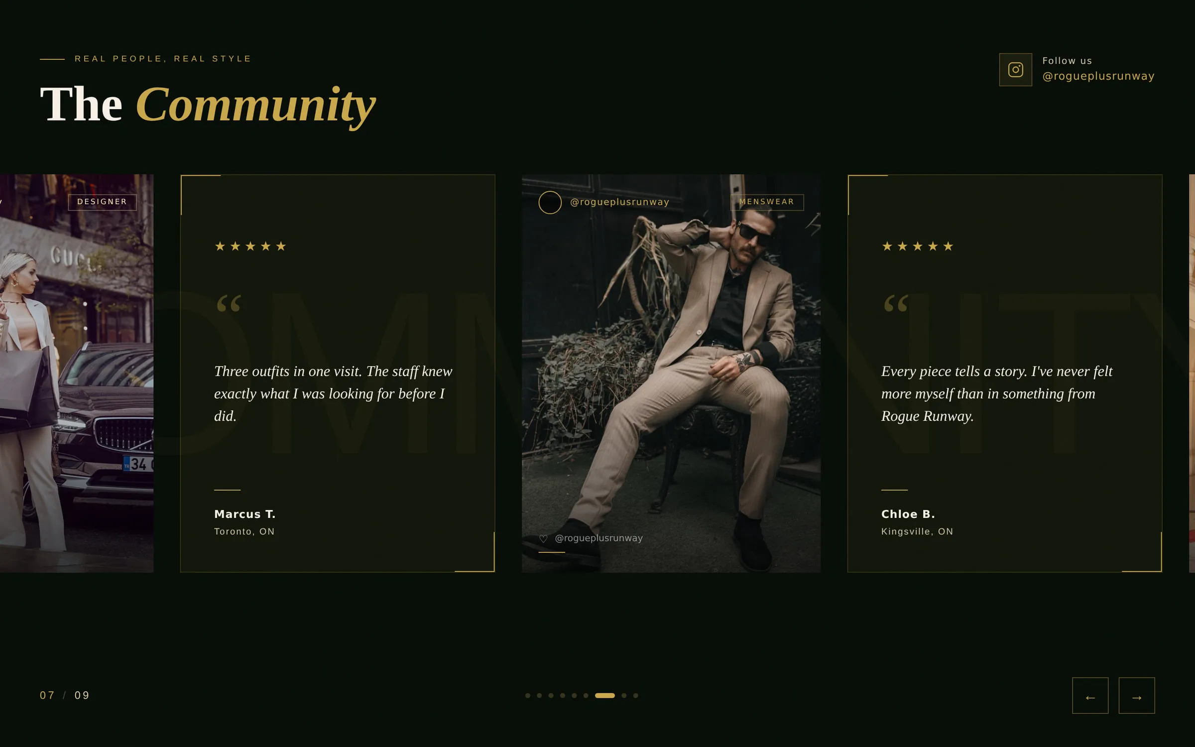
Vintage runs on trust. Buyers want to see pieces on real people before they’ll pay real money for something with no returns and no restocks.
So the social section isn’t a testimonial slider bolted to the footer — it’s a mixed carousel of customer photos and five-star reviews from Windsor, Kingsville, and Toronto, cut to the same rhythm as the editorial sections above it. Proof, styled like content.
Drop Alerts: Turning Scarcity Into an Owned Audience
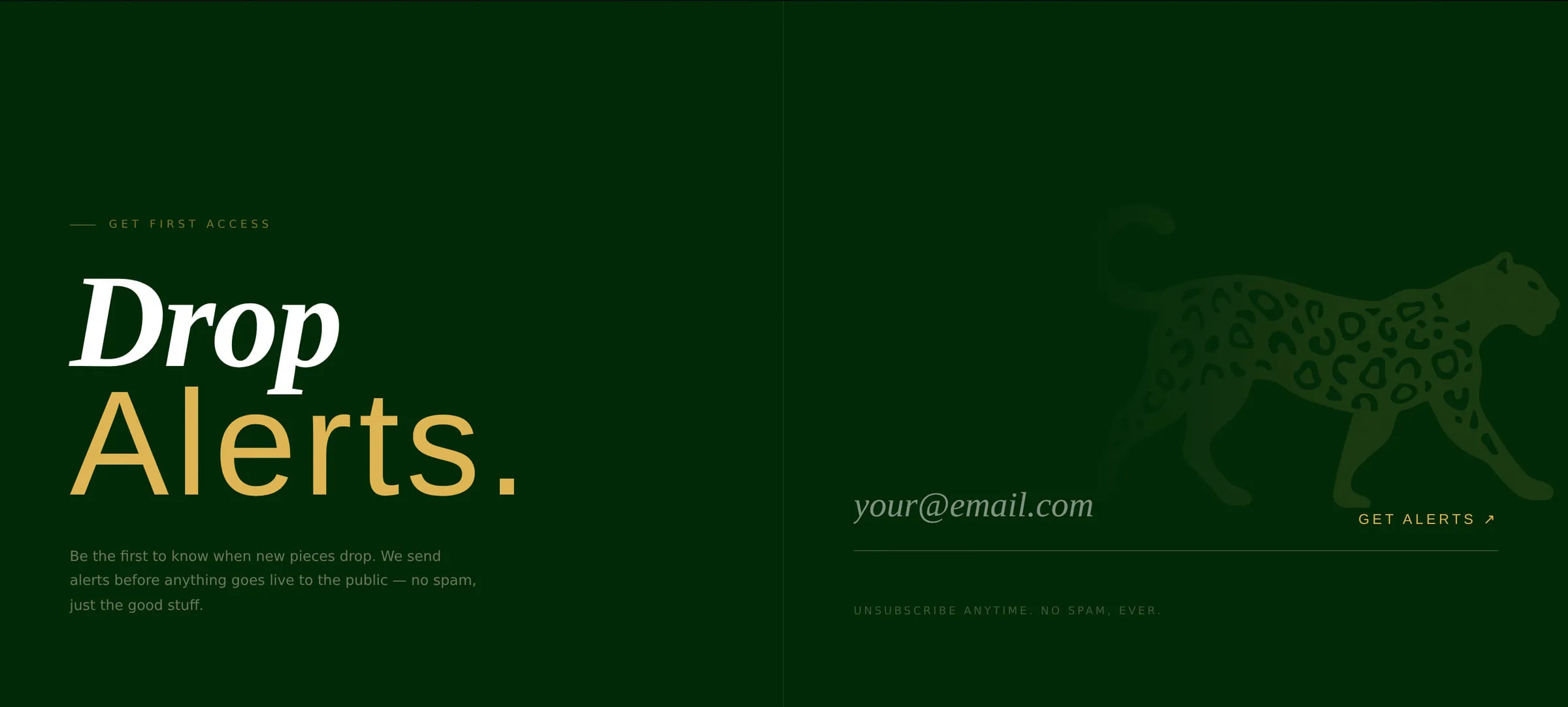
If the strategy is drops rather than catalogue, the mailing list stops being a newsletter and becomes the storefront’s front door. Drop Alerts closes the homepage: early access to new pieces before they go public, framed as an advantage rather than a marketing ask.
For a business selling one-of-one inventory, that list is the single most valuable asset the site builds. Every drop starts with an audience already waiting.
Getting Found in Kingsville
The online brand had to be Canada-wide, but the revenue is on Division Street. So the local layer is deliberate:
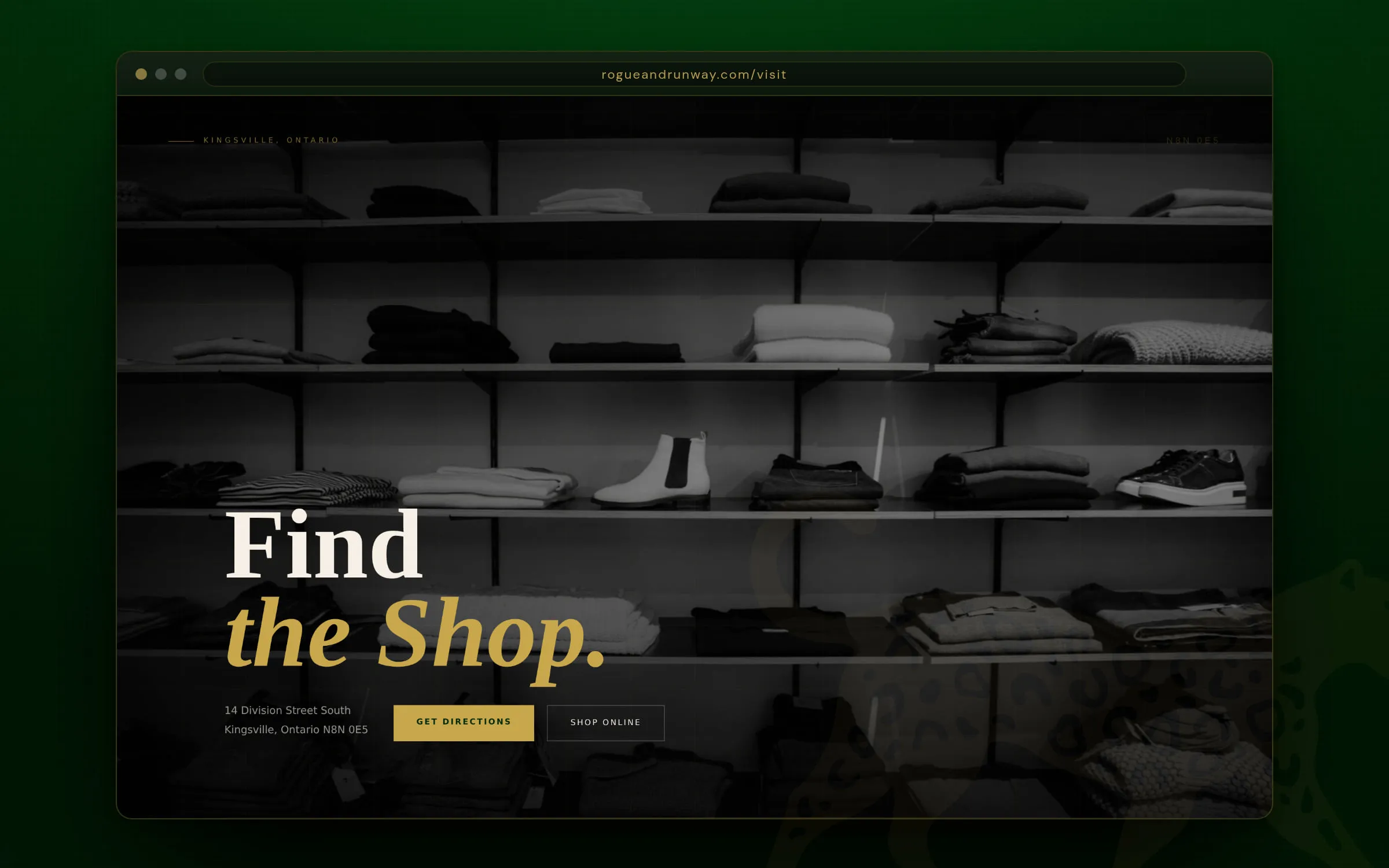
- A dedicated Find the Shop page with address, hours, embedded map, and directions
- Parking and downtown context, because “can I park?” is a real reason people don’t visit
- Location and hours repeated in the footer sitewide
- Local business structured data so Google can read the shop’s details directly
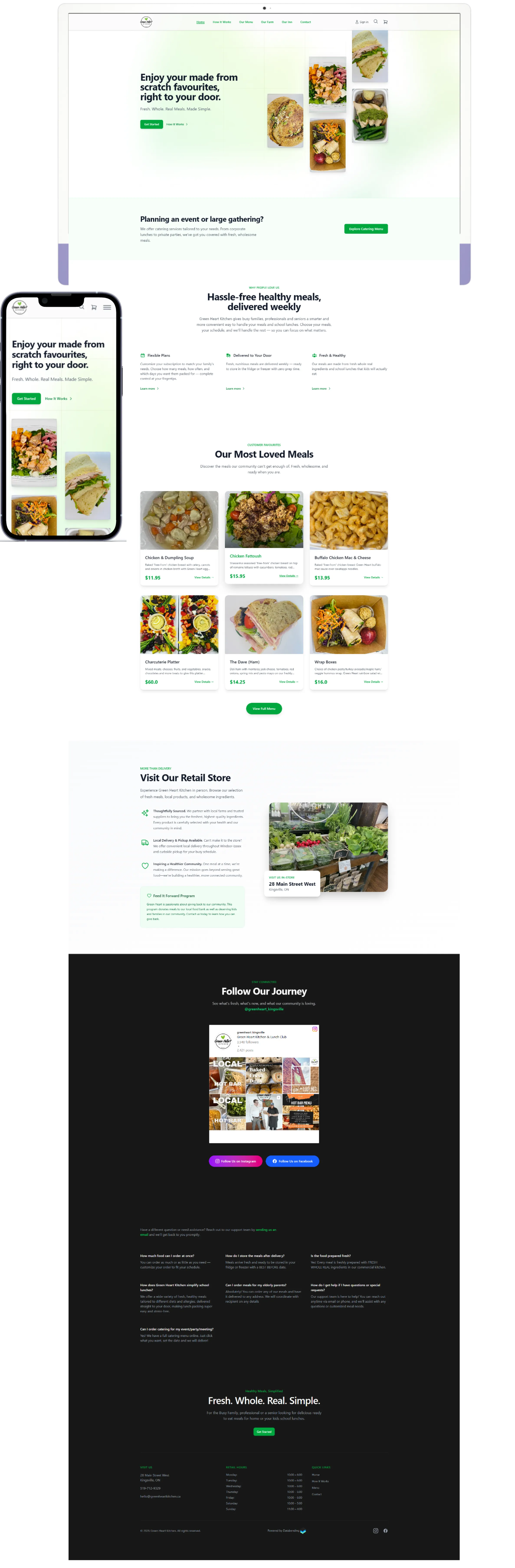
It’s the same local SEO groundwork we laid for Greenheart Kitchen down the road — unglamorous, and it’s what puts a Kingsville business in the map pack.
The Results
$20,000+ in the first month of business.
For a brand new vintage store in a town of 22,000, that’s the number that matters. It came from a brand that reads as premium before anyone touches a garment, a site that sends serious buyers to high-ticket pieces and everyone else to the front door, and a mailing list that grows with every drop.
Rogue + Runway is open at 14 Division Street South in downtown Kingsville — and online at rogueandrunway.com.
💬 Building a Brand Worth the Markup?
If you’re launching a retail brand and a template is going to flatten the idea, that’s the work we do. Fully custom branding, custom Shopify builds, and the local SEO that gets you found in Windsor-Essex.
👉 Book a Free Strategy Call 👉 See Our Web Design Services 👉 Shopify vs WooCommerce for Ontario retailers