How Much Does Real User Testing Cost for E-Commerce? (1,000+ Sessions)

2025-11-18 • by Will Coulter
How Much Does Real User Testing Cost for E-Commerce? (With ROI Data from 1,000+ Sessions)
Last Updated: November 2025
Why smarter insights—not more traffic—drive the biggest revenue wins.
When most businesses want to grow their e-commerce store, their first instinct is simple:
“We need more traffic.”
More ads. More impressions. More clicks.
But here’s the uncomfortable truth:
Traffic is only valuable if your store knows how to convert it.
Otherwise you’re paying for visitors who walk right back out the door.
This is where real testing, behaviour analytics, and session recordings fundamentally change the game. They don’t just show what users do — they reveal why they do it. And when you understand the “why,” you unlock a level of optimization that guesswork will never get you.
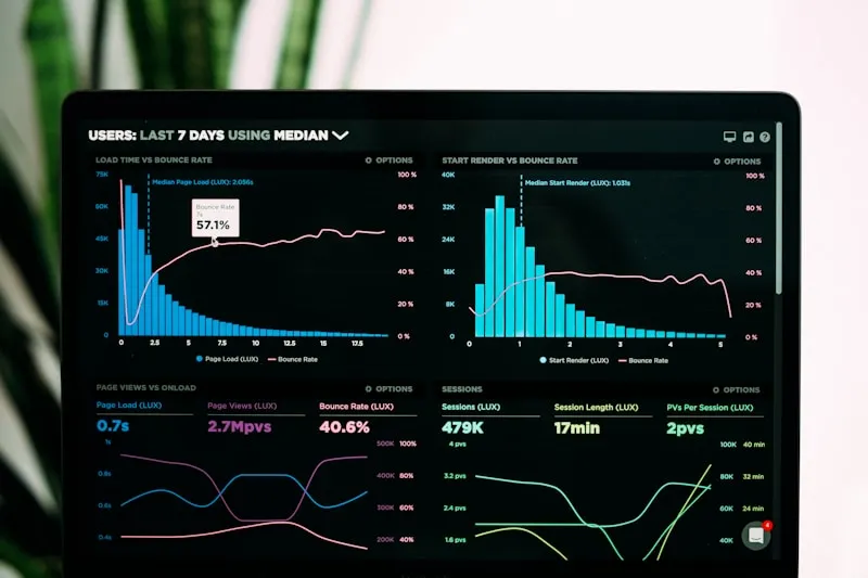
Recently, we ran more than 1,000 recorded user sessions, heatmaps, funnel traces, and pathing reports for one of our e-commerce clients: Pelee Wings, a Canadian retailer specializing in scopes, optics, and binoculars.
What we discovered is the perfect example of why real analytics matter — and why intuitive design is not the same as effective design.
What You’ll Learn in This Report
In this expanded report, you’ll see:
- How 1,000 real sessions revealed UX friction points the brand didn’t know existed
- The metrics that actually matter (and the ones businesses misunderstand)
- Why bounce rate is not the enemy — and how to read it correctly
- What mobile-first behaviour tells us about buyer psychology
- How session replays instantly solve problems static reports cannot
- The CRO opportunities that directly improve conversions
- And how small design tweaks produced measurable improvements on Pelee Wings
By the end, you’ll walk away with a deeper, clearer picture of how real people use your site — and how powerful behaviour tracking becomes once you stop guessing.
TL;DR: E-Commerce UX Testing Costs at a Glance
| Service Type | One-Time Cost (CAD) | Monthly Recurring (CAD) | Timeline | Best For |
|---|---|---|---|---|
| Basic Analytics Setup (GA4 + heatmaps) | $3,000 - $8,000 | $200 - $500 | 1-2 weeks | New stores, validation |
| UX Audit + Session Analysis (100-500 sessions) | $8,000 - $15,000 | $500 - $1,500 | 2-4 weeks | Identifying friction points |
| Full CRO Program (1,000+ sessions + A/B testing) | $15,000 - $35,000 | $2,000 - $5,000 | 4-8 weeks | Serious conversion optimization |
| Enterprise Analytics (custom dashboards + ongoing) | $35,000 - $75,000+ | $5,000 - $15,000 | 8-12 weeks | Multi-brand retailers |
Note: Costs vary based on traffic volume, number of product pages, and complexity of user flows. ROI typically achieved within 2-4 months.
What You’re Actually Paying For
Initial Setup ($3,000 - $15,000):
- Analytics platform installation (PostHog, GA4, heatmaps)
- Event tracking configuration
- Custom dashboard creation
- Initial data collection (1-2 weeks minimum)
Analysis & Insights ($5,000 - $20,000):
- Session recording review (100-1,000+ sessions)
- Funnel analysis and drop-off identification
- Heatmap analysis across key pages
- Mobile vs desktop behaviour comparison
- Traffic source quality assessment
- Written UX audit report with prioritized recommendations
Implementation & Testing ($7,000 - $40,000):
- A/B testing setup and execution
- UX improvements and redesigns
- Mobile optimization
- Speed and performance fixes
- Ongoing monitoring and iteration
1. Traffic Growth Means Nothing Without Behaviour Insights
Pelee Wings came to us with a simple mission:
“We want to understand how users actually use our site — and what’s preventing engagement or sales.”
They weren’t looking for more impressions or more ad spend.
They wanted clarity.
Our Analytics Implementation
We implemented a full analytics stack:
- PostHog for session recording, funnels, heatmaps, and behavioural patterns
- GA4 for traffic source quality, user segments, and Web Vitals
- Server-side event tracking for more accurate attribution
- Custom dashboards for product-level performance and on-site engagement
Over a week, we recorded roughly 1,000 user sessions across product pages, category hubs, blog posts, and the homepage.
What the Sessions Revealed
Inside those sessions were the patterns that told the truth:
- Where users got confused
- What screens caused friction
- Where they hesitated
- Where the site unintentionally pushed them away
- And which experiences made them stay longer, browse deeper, and convert at a higher rate
Most businesses never get this level of clarity — because most businesses are looking at high-level metrics instead of the human experiences underneath them.
2. Page Views, Intent, and What 1.85K Page Views Really Mean
Across the 1,000 sessions, Pelee Wings saw:
- 1.85K page views
- 1.78 pages/session
This is already a strong signal.
What Does 1.78 Pages/Session Tell Us?
It means users were not simply landing and leaving. They were:
- Navigating category pages
- Exploring product-level details
- Comparing options
- Reading information
- Following internal links
For retail/e-commerce, anything above ~1.6 pages/session indicates legitimate browsing intent — not accidental traffic, not low-quality visitors, and not bots.
But data is only useful when it points toward action.
What Can Improve a 1.78 Browsing Depth?
Here are the opportunities this metric highlights:
- Add Recommended Products beneath product detail pages
- Add “People also search for” rows to category pages
- Improve homepage copy to deepen engagement
- Strengthen CTA clarity so users know the next step
- Highlight seasonal or trending products in the header
- Add continuity cues (“scroll to explore more”)
- Use quick-add or quick-view UX to reduce friction
Browsing depth isn’t just a number — it’s a map showing where the customer journey slows down.
And in Pelee Wings’ case, the data said:
“Users are interested — but the site needs stronger nudges to guide them deeper.”
3. Bounce Rate Isn’t the Enemy — If You Know How to Read It
Bounce rate is one of the most misunderstood metrics in all of analytics.
Businesses tend to panic when they see anything above 40%.
But for e-commerce, the healthy range is usually:
Retail & E-Commerce Bounce Rate Benchmark: 20% – 55% (industry standard)

Why So High?
Because:
- Product pages are often one-visit destinations
- Mobile users frequently “peek then leave”
- Comparison shoppers jump between multiple retailers
- People searching for one specific item will bounce once they make a decision
Pelee Wings’ Bounce Rate Analysis
For Pelee Wings, the overall site bounce rate was:
49% (Healthy)
At first glance, that number looks like half of users “aren’t engaged,” but the context tells the real story:
- Their live coast stream page had a 10% bounce rate
- Optics/scopes categories averaged ~49%
- Landing pages varied based on campaign source
What This Level of Detail Reveals
This helps reveal user intent:
- Visitors watching the live stream are high-engagement content consumers
- Visitors entering through product categories have shopping intent but may need clearer paths
- Paid social traffic behaves differently than organic search traffic
Once you break bounce rate down by page type, traffic source, and device, it stops being a panic metric and becomes a diagnostic tool.
📊 Want to See What Your Customers Really Experience?
Stop guessing about user behaviour. Get real insights from session recordings, heatmaps, and conversion funnel analysis — just like we did for Pelee Wings.
Get Your Free UX Audit
4. Organic Search vs Paid Traffic: What the Patterns Reveal
One of the most encouraging findings for Pelee Wings was this:
Paid social visitors were almost tied with organic search visitors.
Why This Matters
This matters because:
- It shows that SEO is working
- It shows that paid social campaigns are well targeted
- It means the customer base is discovering the brand in multiple channels
- It reduces dependency on expensive ad campaigns

Traffic Source Breakdown
Even better, PostHog revealed where those users actually came from:
- Facebook + Instagram (combined top referrers)
- Direct search traffic
- GunPost.ca — a site where Pelee Wings advertises
GunPost.ca, in particular, is a gold mine.
Why?
Because visitors coming from product-adjacent communities are qualified, intent-driven buyers. Someone reading about hunting or scopes on a dedicated forum is not the same as someone scrolling Instagram.
Turning Analytics Into Strategy
This is where behavioural analytics becomes powerful:
When you know where intent comes from, you know how to design for it.
Here’s how insights like these help:
- Adjust landing page copy to match searcher expectations
- Keep the offer consistent with what users saw off-site
- Build category pages around the topics people care about
- Create content that aligns with the referring platform’s audience
This is how analytics turns into strategy.
5. Mobile Comes First — And It Changes Everything
From device data, we found:
55%+ of all Pelee Wings sessions were mobile.
And a large portion of that traffic came from social.

What Mobile-First Really Means
That instantly tells us:
- Mobile speed matters more than desktop speed
- Images must be optimized aggressively
- Buttons need to fit natural thumb zones
- Layouts need to feel “snappy,” not cramped
- Navigation must be instantly understandable
- Product details need to be scannable, not verbose
Mobile User Psychology
Mobile shoppers are fast, impatient, and action-oriented.
They don’t read paragraphs. They don’t tap tiny icons. They don’t hunt for navigation labels.
This is why mobile UX is often the difference between converting social traffic — or losing it.
What Session Recordings Revealed
And thanks to PostHog’s session recordings, we could actually watch the behaviour:
- Users flicking quickly through product categories
- Users scrolling rapidly past text blocks
- Users tapping the wrong menu items
- Users zooming in on product photos
- Users backing out if images took too long to load
This is information Google Analytics alone can’t give you.
6. Session Replays: The Fastest Way to Catch UX Problems
There is nothing — nothing — more insightful than watching a real user struggle.
You can look at reports all day.
But a 12-second replay of a confused user solves problems no spreadsheet ever will.

The Mega Menu Problem
When we investigated homepage bounce rates, we watched a series of short sessions where users immediately left the site.
Here’s what we found:
Some desktop users were struggling with the mega menu.
A mega menu is common in e-commerce (thanks, Amazon), but Pelee Wings’ audience behaved differently:
- They weren’t navigating large categories
- They didn’t want complex hierarchy
- They needed clarity over comprehensiveness
The Solution
Through A/B testing, we replaced the mega menu with a simplified header and saw instant improvements in:
- Homepage navigation
- Time on site
- Product exploration
- Clicking into categories
Another Small But Powerful Fix
Replacing text + icon stream buttons with thumbnail images.
It seems minor — but for many users, the imagery created instant clarity.
Thumbnails told the story faster than labels ever could.
The Essence of UX Testing
This is the essence of UX testing:
You don’t know what’s broken until you watch someone fail at it.
And once you see it, the solution is usually simple.
7. The Big Lesson: Real People Break Assumptions
Even the best UX designers, product owners, and developers make false assumptions.
We all do.
- We’re too close to the product
- We navigate it like experts, not beginners
- We fill in the gaps automatically
Real users don’t.

The Differences That Matter
And the differences matter:
- They misinterpret icons
- They ignore elements you think are obvious
- They hesitate where you expect confidence
- They scroll past content you labored over
- They behave unpredictably
The Powerful Combination
This is why the combination of:
- Analytics (the what)
- Session recordings (the why)
- A/B testing (the proof)
…is so powerful.
Small UX tweaks — sometimes just a line of text or a re-ordered layout — can make a dramatic difference in usability, bounce rate, browsing depth, and ultimately, sales.
8. How Databending Helps E-Commerce Stores Grow Smarter
We help businesses understand what their customers are actually experiencing — not what we assume they’re experiencing.
Here’s What We Deliver:
Behaviour Analytics Setup
PostHog, GA4, event tracking, funnels, heatmaps — built correctly and configured for real insight.
CRO Testing
A/B testing, multivariate testing, copy experiments, and UX variation analysis.
UX Improvements
Fixing friction points, simplifying flows, improving navigation, and designing for real behaviour.
Speed & Web Vitals Optimization
Faster load times, Core Web Vitals improvements, and CDN-level performance upgrades.
Mobile-First Design Reviews
Optimizing for the device most visitors actually use.
Content & SEO Optimizations
Metadata, structure, semantic keywording, internal linking, and topic depth.
A North America–Based Team
No overseas communication gaps. No timezone headaches. No unclear deliverables.
Ongoing Reporting & Testing
Monthly or quarterly analytics reports that highlight opportunities and validate improvements.

Conclusion: See What Your Customers Actually Experience
If you want similar insights for your e-commerce store…
We can install your analytics, review your traffic, collect real session data, and produce a full conversion opportunity report — just like we did for Pelee Wings.
If you’re ready to see what your customers actually experience, we’re ready to help.
About the Author
This case study was created by the Databending team based on real client work. For personalized e-commerce optimization consulting, contact us to discuss your specific requirements.
Ready to Transform Your E-Commerce Performance?
Stop losing customers to hidden UX problems. Most successful optimization projects start with understanding what’s really happening on your site.
🎯 Get Your Free UX Analysis
In just one week, we’ll help you:
- ✅ Record and analyze 100+ real user sessions
- ✅ Identify your biggest conversion blockers
- ✅ Get specific, actionable UX recommendations
- ✅ See exactly where users struggle on your site
What clients discover in their UX analysis:
“We had no idea our checkout process was so confusing on mobile. Databending’s session recordings showed us exactly what to fix. Conversions increased 23% within two weeks.” - Sarah M., E-commerce Director
📊 Get Your Free UX Analysis
Limited spots available - Only 3 analyses per month
REQUEST YOUR FREE ANALYSIS →
